I think it’s awesome to have my artwork, along with other artists from Biennial 28 at the South Bend Art Museum, featured in this music video by musician Eli Kahn. It’s catchy!

I think it’s awesome to have my artwork, along with other artists from Biennial 28 at the South Bend Art Museum, featured in this music video by musician Eli Kahn. It’s catchy!
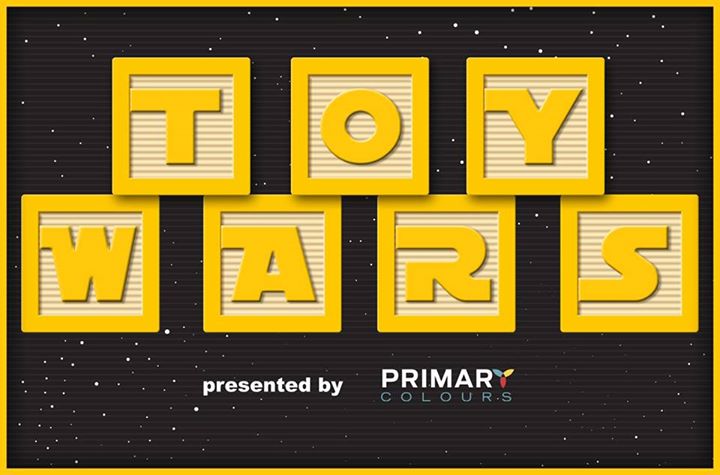
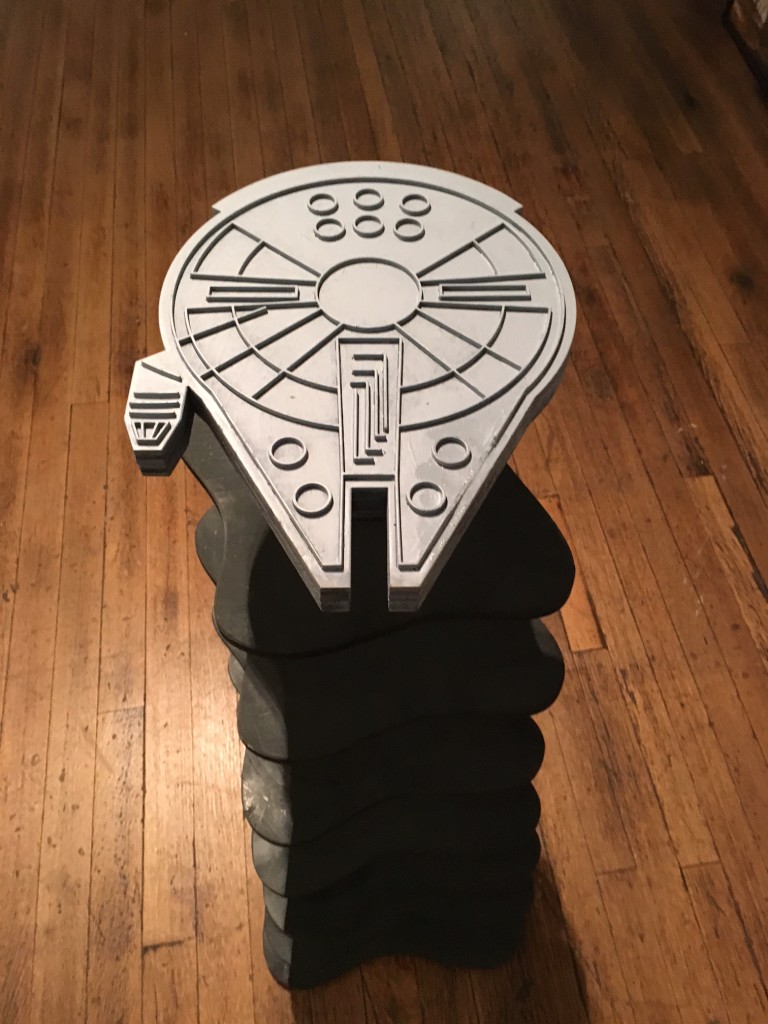
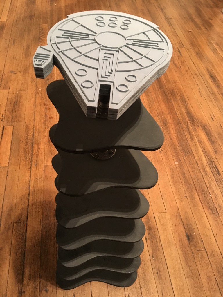
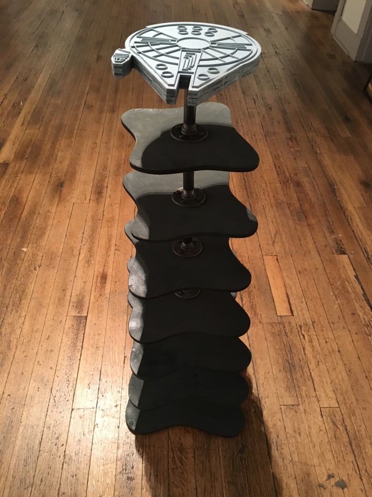
I was thrilled to be asked to participate in Toy Wars this year— Primary Colours annual toy show with a Star Wars twist. I created a 48″ bookshelf– Falcon Bookcase– laser cut out of plywood. This would be perfect for a collection of Star Wars books, dvds and memorabilia.
I was invited to be a visiting critic and speaker at Bowling Green State University on October 16, 2015 and had a great time! I did individual half-hour critiques with 11 grad students and then gave and artist talk about my work. Their grad students work across media— in painting, digital, photography, installation, jewelery, glass, ceramics, design and sculpture. All of the students had different approaches and ideas and it was fun to see the wide variety of artistic practices.


So thrilled to conduct a Crate Space building workshop earlier this year with kids from the Martin Luther King Community Center. The kids built houses, towers, ‘stadium seating’ and even put on an impromptu crate inspired theatrical performance. It was an awesome day!

![]()
It was an honor to serve as a Visiting Artist at Park Tudor on February 27th, 2015. I gave an artists talk and exhibited a small selection of my artwork. It was really fun to meet the students and faculty and to share my work.

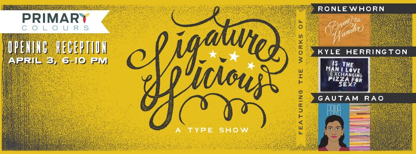
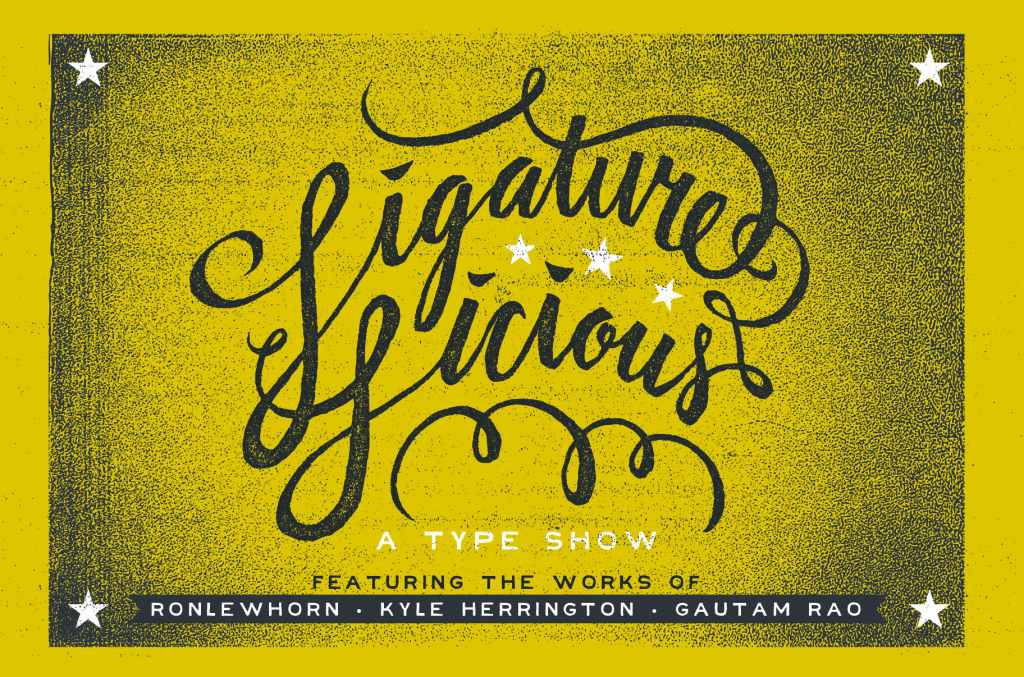
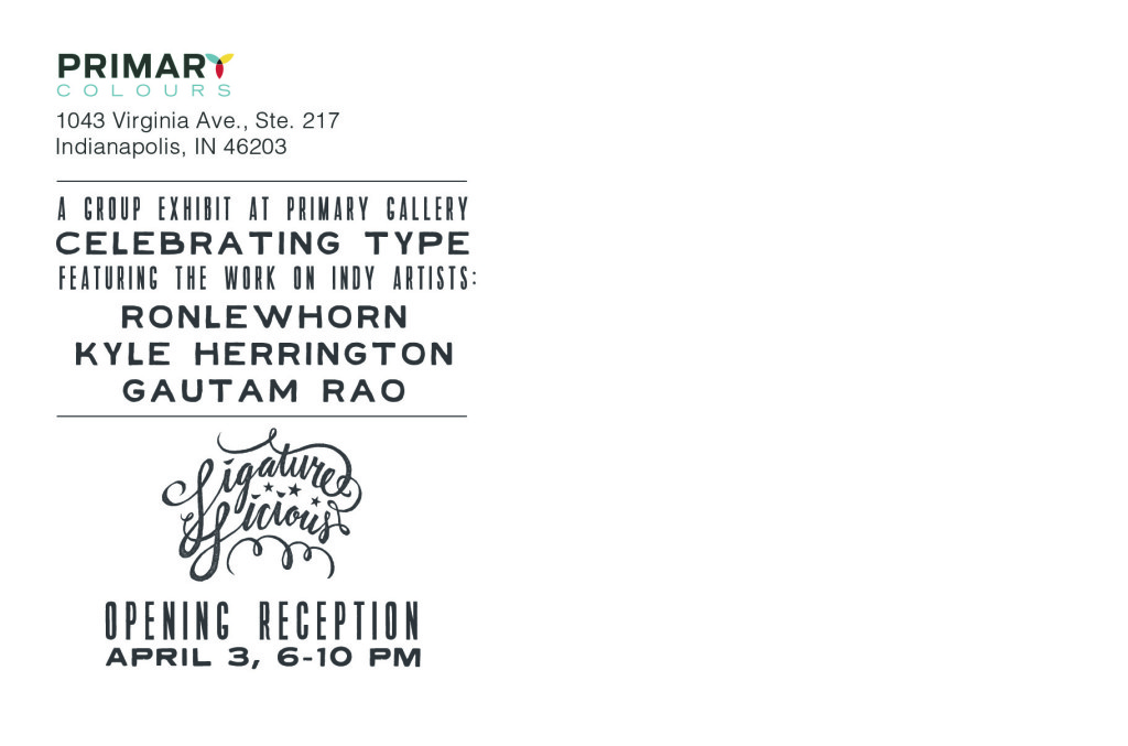
Excited to be part of this text show- Ligature-licious, at Primary Colors Gallery. The group show features my type-based art and work by Aaron Scamihorn and Kyle Herrington. Will be fun! (postcard and header designs by Aaron Scamihorn)

I will be a visiting artist at Park Tudor School here in Indy. Includes exhibit and an artist’s talk. Should be fun!


Color Coded: painting/design by Gautam Rao
The Raymond James Stutz Art Gallery through Nov. 28
Four stars

Synthesis is an overriding concern in the art of Gautam Rao, an associate professor of art at Butler University. In the poster “Thelma and Louise as a Bollywood Movie,” you can see not just a synthesis of fine art and graphic design but also the fusion of American and Indian cultures. Hence the title, lettered in this digital illustration in Hindi—originally created for the Indianapolis International Film Festival Bigger Picture Show. Examples abound as well of Rao’s painting, such as the acrylic on canvas “skyline graph” which you might see as a mash-up of various bar charts and/or a highly pixelated (and colorful) vision of a city skyline. Rao is an artist obsessed with lists; in “Indians, Alphabetically,” he gives you 26 digital illustrations of men, one for each of twenty six Indian names, one for each letter in the English alphabet. Then there’s “The Numbers Series:” blocks of laser-cut acrylic, hanging on a shelf. These small blocks are cut in the form of letters (in various typefaces) spelling out numbers. In these negative spaces (so to speak) carved out by laser, there are passageways containing small metal balls, enclosed by clear plastic. This is 3D art that you can play with. It’s hard not to sense a very positive—and playful—aesthetic, when contemplating this work.
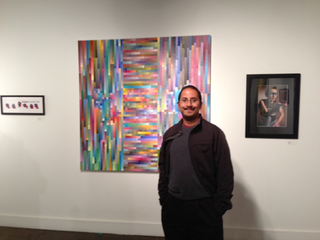
My next solo exhibit is coming up! It’s called Color Coded: painting and design, and is at the Stutz Art Gallery in Indianapolis, IN. Opening reception is on Friday, November 7, 5-9 pm. Details below!


Friday, November 7, 2014, 5-9 pm
Gallery Hours:
Monday, Wednesday and Friday, 11-2pm or by appointment
Free Admission
The Raymond James Stutz Art Gallery
212 W. 10th Street,
Indianapolis, IN 46202
(317) 503-6420
stutzartgallery@gmail.com
Exhibit Statement:
Color Coded: Gautam Rao
painting and design
Color Coded is an exploration of contrasts: between image and text, analog and digital methods and between analytical and aesthetic thinking. Through grid paintings, illustration and typographic experiments, this exhibit encompasses a year of play at the intersection of art and design.
This body of work contrasts highly systematic thinking with a love of the quirky and whimsical. The systematic thinking is embodied in type design and meticulously illustrated alphabet posters. It is also embodied in the technological rigor of working with Bézier curves and within strictly defined color palettes. This analytical approach contrasts with the whimsy of unexpected juxtapositions of color, interactive toys and playful drawings.
The exhibit examines the place where right and left brain thinking meet. It seeks to explore the intersection between art and design.
So proud to have participated in Pixels of Fury Indianapolis as part of AIGA Indy’s 100 years of design in Indianapolis. We had 20 minutes to design a poster with a theme given on the spot. It was super challenging. My design seems to have been lost to the sands of time, for which I am genuinely grateful


I’m thrilled to have two artworks featured in the 70th Annual Wabash Valley Juried Exhibition at the Swope Art Museum in Terre Haute, IN. This year’s juror is Carter E. Foster, the Steven and Ann Ames Curator of Drawings at the Whitney Museum of American Art. The two works featured are the Numbers series and Indianapolis Track. The Numbers series was also selected by the juror for the Sherry Dailey & Tom Tucker Award of Recognition. The exhibit runs at the Swope Art Museum from June 28 – August 23, 2014.


I’m super-proud to have a piece in The Bigger Picture Show for the second year in a row. What you see is a little preview below. I’ll post the whole thing after the show!
The event is from 6:30p – 11:00p Friday May 9th at The Speak Easy in Indy and benefits the Indianapolis International Film Festival. See if you can guess which movie poster I redesigned!


So excited to have my work featured in Typeforce 5 this year! The show opens on February 28th in Chicago and includes an impressive roster of talented designers.


The Arts Council of Indianapolis sponsored a great public art project here in Indianapolis called High Art Indy. I am thrilled to be one of 10 artists chosen to display their work on billboards across the city for a year. So excited to see my work at this scale!
Here’s a feature story on the project from the Butler University website: http://news.butler.edu/blog/2014/01/rao-3/

Just got the postcards for my upcoming exhibit!
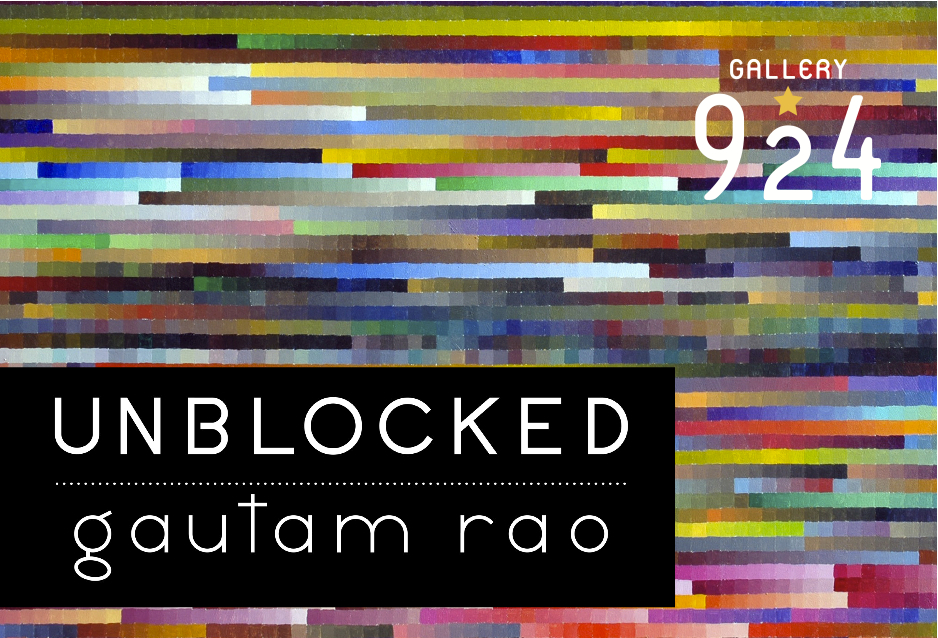
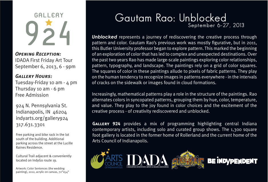
It’s called Gautam Rao: Unblocked and is at Gallery 924 in Indianapolis. It will feature a selection of my grid paintings. It runs from September 6-27, 2013. The Opening Reception is September 6, 2013 from 6-9pm.
Gallery address is:
924 N. Pennsylvania St.
Indianapolis, IN 46204
317.631.3301
Here’s the exhibit statement:
Unblocked represents a journey of rediscovering the creative process. Gautam Rao’s previous paintings were figurative, but in 2011 he took a square canvas, divided it into a grid and filled each square with a unique color. This simple act marked the beginning of an exploration of color that has led to complex and unexpected destinations. Over the past two years Rao has made large-scale paintings exploring color relationships, pattern, typography, and landscape. One painting in the exhibit is inspired by the sequential named colors in the novel ‘The Great Gatsby’, while another group of 26 paintings make up a typographic exploration- a painted alphabet.
The paintings rely on a grid of color squares. The squares of color in these paintings allude to pixels or fabric patterns. They play on the human tendency to recognize images in patterns everywhere- in the intervals of cracks on the sidewalk, faces found in the clouds. The paintings function like puzzles: each viewer sees something different, recognizing something new about themselves.
Increasingly, mathematical patterns play a role in the structure of the paintings. Rao alternates colors in syncopated patterns, grouping them by hue, color temperature and value. These paintings remind us of the color choices we make every day, from choosing which clothes to wear, to deciding to slow down or speed up for an amber traffic light. They highlight the joy to be found in color choices and the excitement of the creative process – of creativity rediscovered and unblocked.
Had a great time at the 3-day font design workshop- Crafting Type. It was fun to dip into FontForge. Here’s what I made:

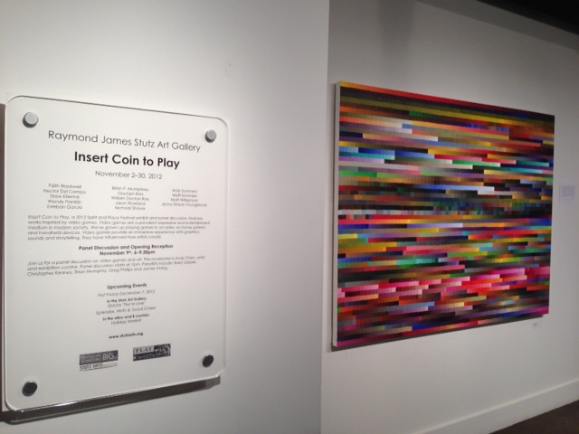
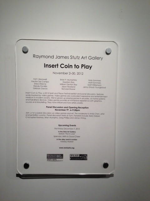
I had a couple of paintings on display in Insert Coin to Play, an exhibit at the Stutz Art Gallery. The exhibit got a good review in NUVO.
I was invited to be a Visiting Critic at the New York Academy of Art. It was an honor, and a really fun experience!
")

The video embedded below is a talk by Daniel Kahneman entitled- “The riddle of experience vs. memory”. Kahneman discusses how the mind can be thought of as two different parts, an experiencing self and a remembering self. The experiencing self is aware of experiences, of what’s happening in the ‘now’. The remembering sense recollects what happened, and places it in a narrative. The remembering sense is primarily responsible for what we remember about our experiences.
An analogy can be made between this way of thinking and painting. The experiencing self is in charge while painting, while the work is being made. We have experiences, but we’re not quite sure what they are and it’s hard to articulate them. Painters often use the word ‘intuitive’ to describe this phase, while they’re working. It’s used to mean- “I have no idea what I’m doing” or “I know what I’m doing but don’t care to explain it.” The artist can’t place their work in a narrative.
It’s only after the work is completed (and often after some time has gone by) that the remembering self takes over. The remembering self can articulate what the artist was trying to accomplish and what the artist was thinking about. The remembering self can put the artistic process into a cohesive narrative allowing the artist to talk about and understand their own work.
However, there is a gap between these two selves and the experiences they describe. The story as described by the remembering self makes sense, seems cohesive, but doesn’t completely capture the true nature of the experiences.
Some artists have a very difficult time articulating what they’re doing or what the intent of their work is. Perhaps they are responding only with their experiencing selves. Their experiences are truthful and vivid, but can’t be articulated by their remembering selves.
Kahneman’s idea is useful in separating the information (or often verbal gobbledegook) of an artist’s statement with what could be seen as the inherent truth of the artwork itself.
This painting is fighting me. The gunky canvas surface is making it harder to get the textures and details I’m looking for. It’s a nice location though. I had three people stop by to chat- two friends and one shutterbug with an awesome Leica camera. The painting will need at least another session or two if it hopes to reach Finished Paintingdom. We’ll have to see how it goes…

Painting at the end of day 2

Larry drops by for a visit
The first outside painting day of the year found me not far from the previous painting spot. The lumber store I like to go to has been closed for New Year’s so I had to paint on an existing canvas, in this case the one that was left over from Restless Portrait, layers of acrylic paint and all. The previous painting had Bob’s Gas station and the bank vaguely in the background, and these show up a little more prominently in this one. I was attracted to this spot by the sheer nondescript blandness of the back of the Safeway grocery store. There’s a large, fairly vacant stretch of asphalt and the windowless back edifice is distinctly plain. The roof has a gently curved structure that gives the view some evocative power- in this case the curved roof evokes for me a domed temple.

Beginning Behind the Safeway with a Toned Canvas
These bland urban inter-spaces have long had a prominent place in American landscape painting, with Edward Hopper probably the recognized master of the form. Hopper’s work seems to comment on a particular American disconnectedness, a sense of alienation.
While I revere Hopper, this is not quite what I want the work to be about. I think we live in a different age, a more connected time. These lonely, marginalized spaces exist, but perhaps how we see potential and the possibility for change in them.
Another contemporary American painter who deals with what he calls these “Non-Places” is Trevor Young, someone I was in high school with. Trevor takes this nondescriptness to a grand scale and adds some really beautiful paint handling to the mix.
Today I was aware that in standing in the Safeway parking lot I was technically ‘trespassing’, standing on privately-owned space that is not truly public, shared, communal space. The act of setting up my easel and my painting paraphernalia is a way of claiming this space, domesticating it, somehow making it more human scale and accessible. This was brought home to me when a gentleman pulled over in his truck and stepped up to chat with me about my painting. He was an artist himself, someone who likes to draw. I felt that, if only for a short while, I had made this otherwise fairly unwelcoming space one where conversations and artistic chit-chat were possible.

view of the back of the Safeway and my easel
The painting at the end of the day has a reasonable amount of progress and a good start to subsequent sessions. I was only able to work on this for an hour and forty minutes. It was roughly 24° and very, very cold even though it was sunny. Let’s see what subsequent painting sessions hold for this work.

painting as it stands at the end of the session
Today was the second (and final!) day working on this painting. We’ve had some rain and warmer weather so the snow was melting and things were slushy. We also has a 3.8 magnitude earthquake this morning, with the epicenter about an hour north.
It immediately became clear that I’d have to change the painting to incorporate the now visible grass and the slushier snow.

Painting begins on Day 2 with the snow melting
Not long after I’d started painting I turned around to see a reporter and a videographer standing nearby. They asked me if I’d felt this earthquake this morning. I said “No, but things seem to have shifted slightly between day before and today.” The clip showed up on the evening news today and is embedded and linked to below. Pretty hilarious. I guess I can now put an ‘as seen on TV’ sticker on the painting. (as a side note, the reporter seriously deserves an award for pronouncing my name perfectly).

videographer from WTHR Channel 13
link to video: http://www.wthr.com/video?autoStart=true&topVideoCatNo=default&clipId=5427584&flvUri=&partnerclipid=
After the hubbub, it was time to buckle down and work. I modified, painted over or added to every area of the painting.
I painted the grassy spots revealed by the snow melt and tried to make the trees more organically shaped and varied. The local bank branch is visible at the left edge of the painting as is Bob’s Gas Station in the background. The sign that’s at that slightly crooked angle reads ‘Illinois St’ and “Stop Ahead”. I also added the oncoming SUV and the cars stopped at the light because the picture really needed some sense of human activity and human scale. The headlights and brake lights are all on because I’ve always felt that seeing headlights on during the day has a surreal touch to it. As to the ambiguity about which lane the oncoming SUV is in? I’m going to chalk that up to artistic license and how swervy some drivers are.
")
finished painting- 'Westfield and Illinois in Winter' 16" x 20" (as seen on TV!)
The painting’s finished and I’m pretty happy with it for a quick two days of work. The important thing is- there are some pretty unique stories that came out of the process.
So this is today’s story. Very recently I’ve begun to see paintings again. What I mean is, I’ll be out for a walk or an errand and I’ll see a grimy CVS parking lot and the scene will cry out to me to be painted. I’ve been seeing potential paintings everywhere; particularly around Westfield Blvd. This particular scene contrasts the shimmery nature of the canal water with the intricate complexity of the retail shops to the left. It’s a classic nature/culture pairing and I was eager to get out and paint. To me these views are not particularly noteworthy or picturesque, but they speak to me on a deep level. To take the ordinary mundaneness of the routine and see something special in it.

A sunny start to the day

things are roughly sketched out at this point
The trees are dripping a bit at the bottom with the addition of some linseed oil to the paint. The session had some of the challenges associated with painting on the spot-a few of the paint tubes were crusty and I couldn’t get them open. But I’m relishing the challenge of doing this work and found ways to work around the unopenable tubes.

close up of painting being sketched out

stage that it’s in at the end of the day

all bundled up to paint
There’s still quite a bit of work to do on this. I don’t know that I’ll be able to get out in the next two days, but hopefully I’ll be able to soon. Let’s hope the snow stays in place!
These are in-process shots of a new painting in the works. It’s a simple painting, meant to be a warm-up for other work that’s coming up. Possible titles at this point are “Mugged” (cute) or “Interlocking Rings”.

Studio shot of Mug Painting in Progress- Stage 1
I associate these mugs with a warmth that seemed appropriate for wintertime. I’ve painted one of these guys before in Still Life with Webster’s.

Studio shot of Mug Painting in Progress- Stage 2
I was attracted to the set-up by the way the handles of the mugs overlapped- hence “Interlocking Rings”. I was thinking of this delightful Vi Hart video, part of her series on the connections between drawing, doodling and math.
The noisy studio in the post title refers to the dialogue that happens as the painting is created. What could be a quiet, meditative process turns out to be a noisy one with cameos by lots of ghosts and voices. As I studied the top of the mug on the right, I was struck by how dark it gets near the rim. I felt that heavy darkness made me look ‘under’ it and created a welcome sense of tension in the painting. This idea of looking under a line or shape in a painting has long haunted me. It’s straight out of Diebenkorn, Ocean Park- a painting like “Ocean Park No. 129” where he gets you to look under the lines at the top like ducking your head under a clothesline.

Richard Diebenkorn- Ocean Park no. 129
The dialogue and free-association are part of the pleasures of the painting process for me. I’m hoping to wrap this one up soon. It’s getting pretty close.
Tomorrow, I’ll be a speaker at the event: 7 Simultaneous Lecturers: Indy Arts and Globalization
I’m speaking about “Design Art in Indianapolis” and highlighting some really exciting local designers and artists:
Terry Border, Amy McAdams, Artur Silva, Emma Overman and Ryan Abegglen. Should be fun!

Variations on Roses done in Adobe Illustrator.

Spaceship Rose

Ziggarat Rose

My video “Restless Portrait: A Disappearing Painting” was selected for inclusion in the exhibit: Erasing Borders: Passport to Contemporary Indian Art of the Diaspora 2009 organized by the Indo-American Arts Council. The opening was this weekend at the Dowd Gallery at SUNY-Cortland. I’m thrilled to be a part of this exhibit!


I’ve been anxious to put together a website for sometime now, but I was stumped by the design of it. I wanted to put my work into neat categories- paintings, videos, design etc. and subcategories- digital life, blocks etc. but some videos were of paintings, and works about blocks were done in both painting and photography. The tidy buckets I’d hoped to build were broken even before I’d made them. In frustration I went to my friend Jon Sorenson, a genius Computer Science professor at Butler University, and within ten minutes he’d solved my problem. He immediately advised me to use a category system whereby items could easily reside in more than one category. This multivalent approach really helped to break the narrower view I was trying to impose on the work. The suggestion I most valued was where he pointed out that for future work, I shouldn’t have to worry about which category the work would fall in. Under the approach he suggested the new work could find its own categories organically and without predetermination.
This conversation jogged something in my memory, I remembered David Weinberger’s book, “Everything is Miscellaneous” and I read it immediately. I loved it, and his discussion of tagging led to the tag cloud on the landing page of this site, and the tag collection in the sidebar. I love his discussion of the three orders of order, and have been fascinated by his ideas. I’m intrigued to think of the impact category-atomization might have on academia.
Anyway, that’s the story of how the current organization scheme of this website came into being. It will be interesting to see how long this system works for this site.

As the saga of getting this website up and running continues, I’ve added another element to the design. I’ve decided to release my work under the Creative Commons Attribution-Noncommercial-Share Alike 3.0 United States License. I did a good amount of research about this “some rights reserved” approach and feel that it’s appropriate for my work. I hope others can share and benefit from the work I’ve done. The only works that this does not apply to are those for which I’m not the copyright holder, eg. the logos and other commercial work I’ve done.
I’ve used CC licensed audio tracks for videos I’ve done and I’m excited to see if people find ways to use my work. I’m a fan of Jonathan Coulton and Becky Stern, and both of them use CC licenses for their work. Larry Lessig is such a compelling speaker and advocate for Creative Commons and videos of his talks played a role in the decision. (by default the WordPress theme I’m using (deFusion) adds a “Copyright ©” line to the footer). My CC attribution label is in the footer of this site, so share, remix and otherwise enjoy my work!

A bit of exciting news! I’ll be presenting at the 2009 Hawaii International Conference on Arts and Humanities in Honolulu on January 9th, 2009.
My paper is entitled: Painting in the Digital Age: When Pixel meets Paintbrush. Here’s the abstract I submitted:
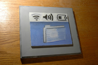
This paper examines my paintings from the series “Digital Life”, comprised of computer screen imagery rendered in oil paint. The paintings form a link between traditional painting and the contemporary digital world and as such, connect the past with the present.
As an avid museum-goer, I am startled to see how little time viewers spend looking at paintings, but will spend countless hours staring at digital screens. My idea, in order to bridge this divide, has been to turn the screens into paintings: to inject the texture, brushwork and physical quality of oil paint into the virtual, technological realm.
The subject of these paintings is the UI (User Interface) design of computers, the icons and symbols that characterize the digital experience. This interface is familiar to millions of people, often as a mundane feature of their work-lives. By making paintings of them, I am memorializing an experience that millions have on a daily basis; in a sense finding art within everyday experience.
This paper examines these paintings within the context of both contemporary painting and the historical oil-painting tradition. Additionally, this work is influenced by innovations in the fields of computer science and graphic design, and these connections are highlighted and examined.
Finally, since digital images of these paintings are scattered all across the Internet, I examine the recursive nature of making paintings of computer screens and displaying them on the Web.
In an era when there is fierce competition for people’s attention, and digital screens are often examined far more closely than paintings, my work forms a bridge between the two, breathing new life into the dialogue.
One of my Graphic Design students, Audrey Carie, won the top prize in the DAAD Poster Contest. She won an all-expenses paid trip to Documenta12 in Kassel, Germany. Another student, Anne Cauley, had her design chosen as an Honorable Mention. Very exciting!
This is Audrey’s design:

and here’s Anne’s:

Olga Yiparaki has posted some photos of this painting in a tasteful, minimal frame. Her Flickr set is here. I think it looks really nice.
I created a Painting Matching game using Scratch. Click the image below to check it out.


contact me: gautam@gautamrao.net
